This video is very interesting to watch, and also shows the amount of time and thought that went into it! Even though the video it's self is short there was definitely a lot of work that needed to be done in order to get it to work. The advertisement it's self was created by Lithuanian digital film making and design studio KORB for the 2010 Eyeka contest.
The 30-sec non-official spot, directed by CGI maestro Rimantas Lukavicius, features dancing Coca-Cola bottles moving in harmony and changing shape in accordance to music made by a harp. I really enjoyed this video and needed to share this with all of you! Please see attached link below to view.
http://designtaxi.com/news/351928/Agency-Creates-Dancing-Bottles-Spot-For-Coca-Cola-Video-Contest/
Wednesday, 21 March 2012
Yo Momma jokes for graphic designers
This made me chuckle almost instantly! Ross Moody, the one-man design team at 55 Hi's design studio has created the first ever "Yo Momma Is a Shitty Graphic Designer" printable pad, that features the newest "yo momma" jokes since the cancellation of In Living Colour.
sample joke- "Yo momma is so ugly she broke clone stamp"
to view more jokes as well check out Ross Moody's work please view that attached link below:
http://www.fastcodesign.com/1669135/yo-momma-jokes-for-graphic-designers
sample joke- "Yo momma is so ugly she broke clone stamp"
to view more jokes as well check out Ross Moody's work please view that attached link below:
http://www.fastcodesign.com/1669135/yo-momma-jokes-for-graphic-designers
A day in the life of Ants
A Russian photographer by the name of Andrey Pavlov has photographed these tiny creatures in various scenarios ranging anywhere from their natural environment to staged creations / scenes of his own imagination! Pavlov definitely has an eye for detail, and creates a lot of visual interest in all of his photos! He is definitely a photographer to check out!
for more information on Andrey Pavlov and his work please follow the attached link:
http://www.neatorama.com/2012/03/07/ant-tales-by-andrey-pavlov/
for more information on Andrey Pavlov and his work please follow the attached link:
http://www.neatorama.com/2012/03/07/ant-tales-by-andrey-pavlov/
Post-it structures by Yo Shimada
Whoever thought that post-it notes could be used to make sculptures as well as for writing reminders is a genius! Yo Shimada, of tato architects has done just that! In cooperation with the students of Kyoto University of Art and Design, Yo Shimada has created a giant installation consisting of 30,000 post-its that are arranged and assembled in such a way to mimic that of a tiny metropolis. Simply stunning, to find out more about Yo Shimada and his work please follow the attached link below:
Tuesday, 20 March 2012
A perfectly warmed bath
What a fantastic idea! Designers Sunmi Hwang, Hyunjoo-Lee and Jiwon-Seok have channelled the basic principle of magma of a submarine volcano into the design of their "Warm on" units. The concept behind this device is to keep your bath water consistently warm while your bathing. The "Warm on" is designed to circulate the water in your bath and keep the water at a consistent temperature while your bathing. The designers also kept with a natural and ergonomic design to mimic a pebble, how feng shui!
Check out the attached link to find out more about the "Warm on" device
http://www.yankodesign.com/2012/03/19/perfectly-warmed-bath/
Check out the attached link to find out more about the "Warm on" device
http://www.yankodesign.com/2012/03/19/perfectly-warmed-bath/
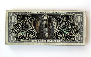
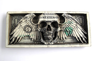
Laser-cut dollar bills by Scott Campbell
This is a very interesting way to create artwork that definitely makes you stop and take another look at the American Dollar bill! Scott Campbell, a Tattoo artist who has sculpted dollar bills by using a laser cutter to create some amazing pieces of art! His artwork has inspired me to think differently when it come to choosing materials/ canvas when creating pieces of my own!
To find out more information on Scott Campbell's work please follow the attached links below:
http://www.divinecaroline.com/22272/72017-art-dollar
http://www.psfk.com/2012/01/dollar-bill-skull.html
To find out more information on Scott Campbell's work please follow the attached links below:
http://www.divinecaroline.com/22272/72017-art-dollar
http://www.psfk.com/2012/01/dollar-bill-skull.html
Sportswear Brand ‘Showers’ A Cat to test it's products
The highly notable brand of outdoor sporting gear in most peoples mind would be Columbia. Everything from their rock climbing shoes to their extremely popular outdoor jackets. The brand it's self triumphs over it's competitors in many ways, making any of their items pretty expensive, but durable. With this in mind Columbia has a lot to live up to, which might explain their most recent advertisement to promote their new jackets that claim to have an ultra-breathable waterproof shell. The advertisement it's self is based around the theory that cats hate water. The commercial first shows the cats dislike of water and goes on to put the cat into one of their jackets under a sprinkler to show the jackets effectiveness of keeping the cat dry. This is a very interesting take on an advertisement, that's sure to grab a lot of peoples attention! As entertaining as the Ad may be, I do not think the use of an animal in this way is really appropriate, because it may be sending the wrong message to naive customers as well as animal rights activists.
To each is own, to check it out for your self follow the attached link below:
http://designtaxi.com/news/351947/To-Put-Its-Products-To-The-Test-Sportswear-Brand-Showers-A-Cat/
To each is own, to check it out for your self follow the attached link below:
http://designtaxi.com/news/351947/To-Put-Its-Products-To-The-Test-Sportswear-Brand-Showers-A-Cat/
Swissmiss: Mons Lavabo
Swissmiss is a design blog/studio run by Tina Roth Eisenberg a Swiss designer gone NYC. This studio has come up with an amazing design concept for children's washbasins! Taking in all of the concerns of traditional washbasins, and improving upon them. Everything from basic functions such as: soap dispensers, height, hand dryers, faucets and selecting the appropriate materials in which to get the job done! The added bonus is the appealing kid friendly designs of the overall units, that are to be used in high kid trafficking zones such as schools and day cares. Besides the functional improvements, now the child has a new, pleasant and like able experience, which is the reason that they have designed the units in attractive forms that would appeal to children. The child introduces their hands in the smooth mouth of the figure which can be pleasant, and the fun is enhanced by the tooth element!
The chosen material used to create these creatures is called “Duralmond”, which is a material obtained from the mixture of synthetic and natural resins. Its composition is very resistant and light, as well as 100% biodegradable and recyclable. In addition, its waterproof quality makes it ideal for humid areas, and it is also fireproof. “Duralmond” is a composite material of crushed almonds husks and other additives. This plantbased material is used in the manufacture of biodegradable and recyclable objects by means of the
molding technique.
Overall this was a great example of a strong design concept with a very practical application! This design studio really took every aspect of this idea and turned it into something amazing... all I would like to know is how do I get one? ;)
To find out more information about the Swissmiss studio as well as this project follow this link:
http://www.monslavabo.com/
Swissmiss has an online PDF of the Mons Lavabo project on their website
Subscribe to:
Posts (Atom)


